
Schools are still segregated
Segregation is dead, long live segregation
When I think of segregation, I think of a historical event. Something begun under the umbrella of government agency and vanquished by collective endeavor. However, the data suggest that despite the end of exogenous state-sponsored inequity, we see a emergent clustering of ethnic groups in America that produces non-homogenous demographic distributions in k-12 education. Below we investigate the scope of this phenomenon using a number of quantitative techniques.
Demographics are distributed regionally, then locally
Before we evaluate local clustering in school populations, we must begin by decoupling it regional phenomena. Not every state has the same demographics. There exists majority minority states (Hawaii, California, Texas) and majority white states (Vermont, Maine, West Virginia). We are a collective of vaguely autonomous republics and any evaluation of a student body of a particular school must be contextualized by the statistics of the state in which it is located. Below we see the white proportionality of each state:
What does modern segregation look like?
Unlike de jure segregation of the past, modern racial clustering is not usually a consequence of direct state action, but rather an emergent phenomenon arising from the interface of human behavior and public policy. In fact the supreme court ruled in 2007 that it was unconstitutional for state actors to forcibly integrate schools - so racial separation today is a passive, bottom-up process.
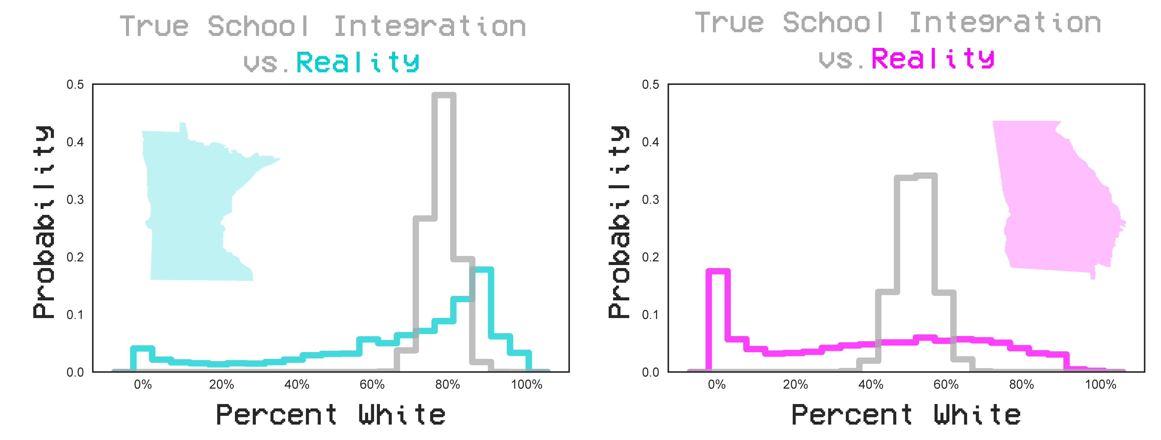
To examine the face of modern segregation let’s consider the following two high-schools : Minnetonka High just outside of Minneapolis, MN and Berkmar High just outside of Atlanta, GA. Minnetonka is predominantly white and Berkmar is predominantly non-white, but that alone is not enough to indicate segragation.
The question is - how well do the demographics of these schools mirror the demographics of the state? Are they representative of a well mixed population? To gain context, lets consider a hypothetical distribution of schools that comes from random resampling of the total state demographics. Here, we would expect some variance in the demographics of the schools as a function of the the error in bootstrap resampling. However, we can see that the distribution remains relatively homogenous with schools neither being purely white nor purely non-white. Reality is very far from this randomly generated distribution. For both Minnesota and Georgia, we see many schools are not well mixed - the ensemble of schools expresses a heterogeneous range of demographics.
The qualitative difference are clear, but what quantitative metrics can we employ to compare the relative segregation of each state.
First lets borrow a tool from information theory Kullback Leibler divergence. This is a non-parametric calculation of how similar two distribution are. In this case, we can compare how similar the actual demographic distributions of schools in a state are to the distribution that would be generated from pure random sampling.
Alternatively, we can solve the binomial proportion confidence interval formula for how unlikely randomly sampling a school population would be. In this case $\hat{p}(x)$ is the observed percentage of white people in a school, ${p}(x)$ is the state wide percentage, and n is the number of students in that school. The z score can be understood as a measure of unlikeliness that that school population could occur randomly - or how segregated it is.
Then we can average that over all k schools in the state.
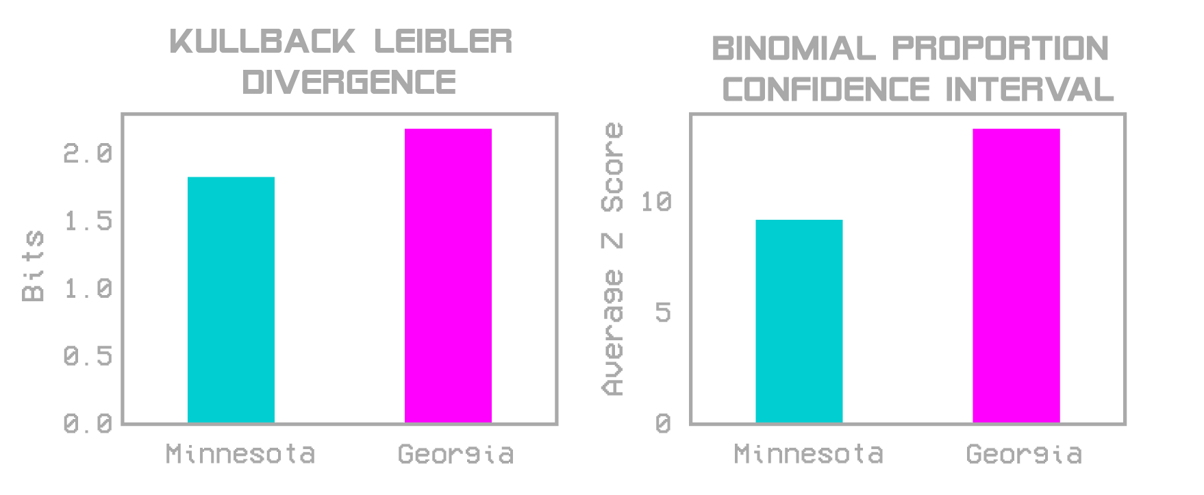
We see that both metric confirm similar trends : that Minnesota is less segregated for its demographics than Georgia.
Segregation manifests spatially
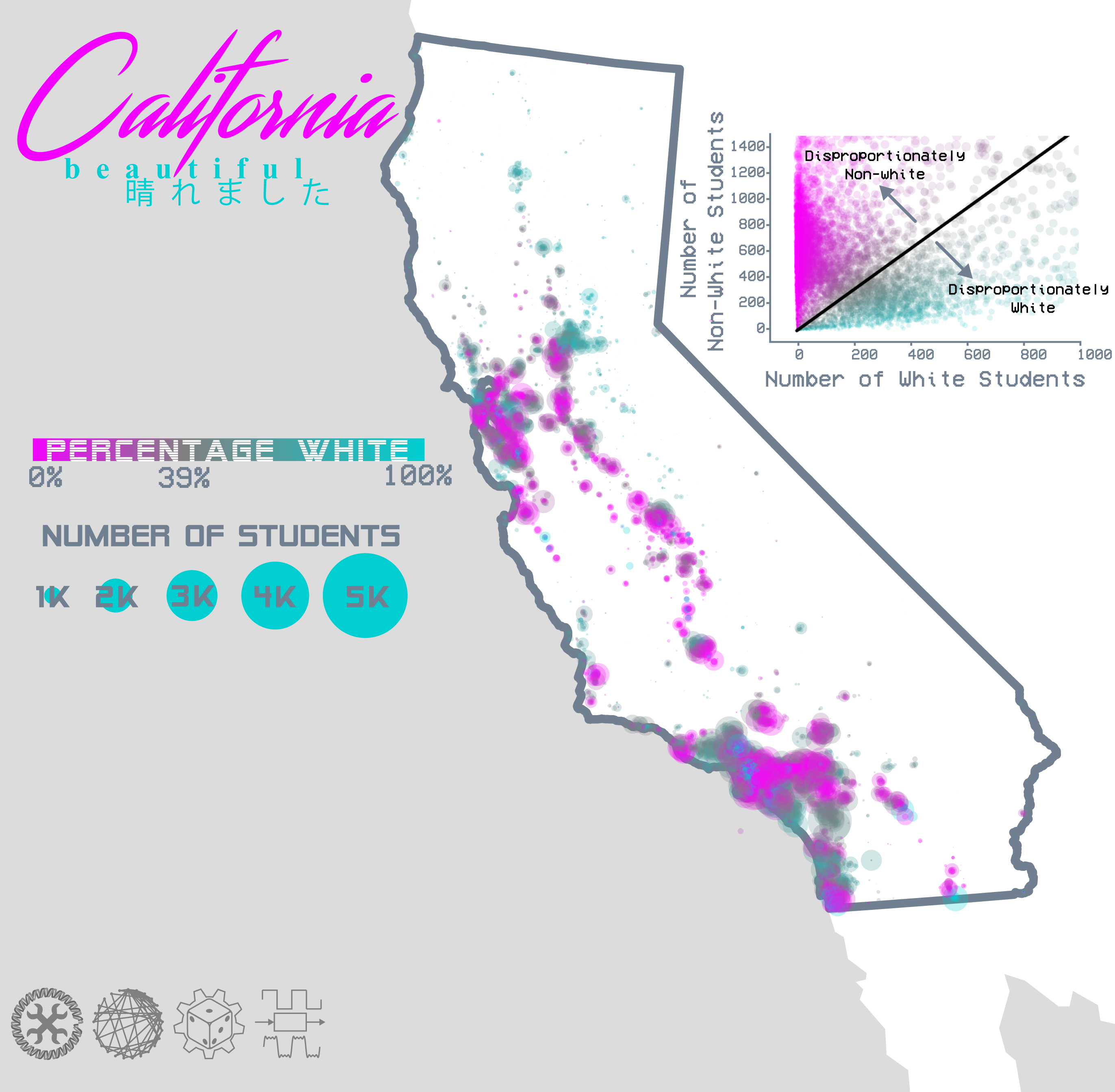
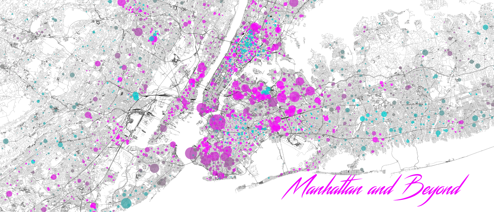
An important element of these data is the spatial component. See the maps below of the first and fourth most populous states and how their school demographics are distributed spatially.
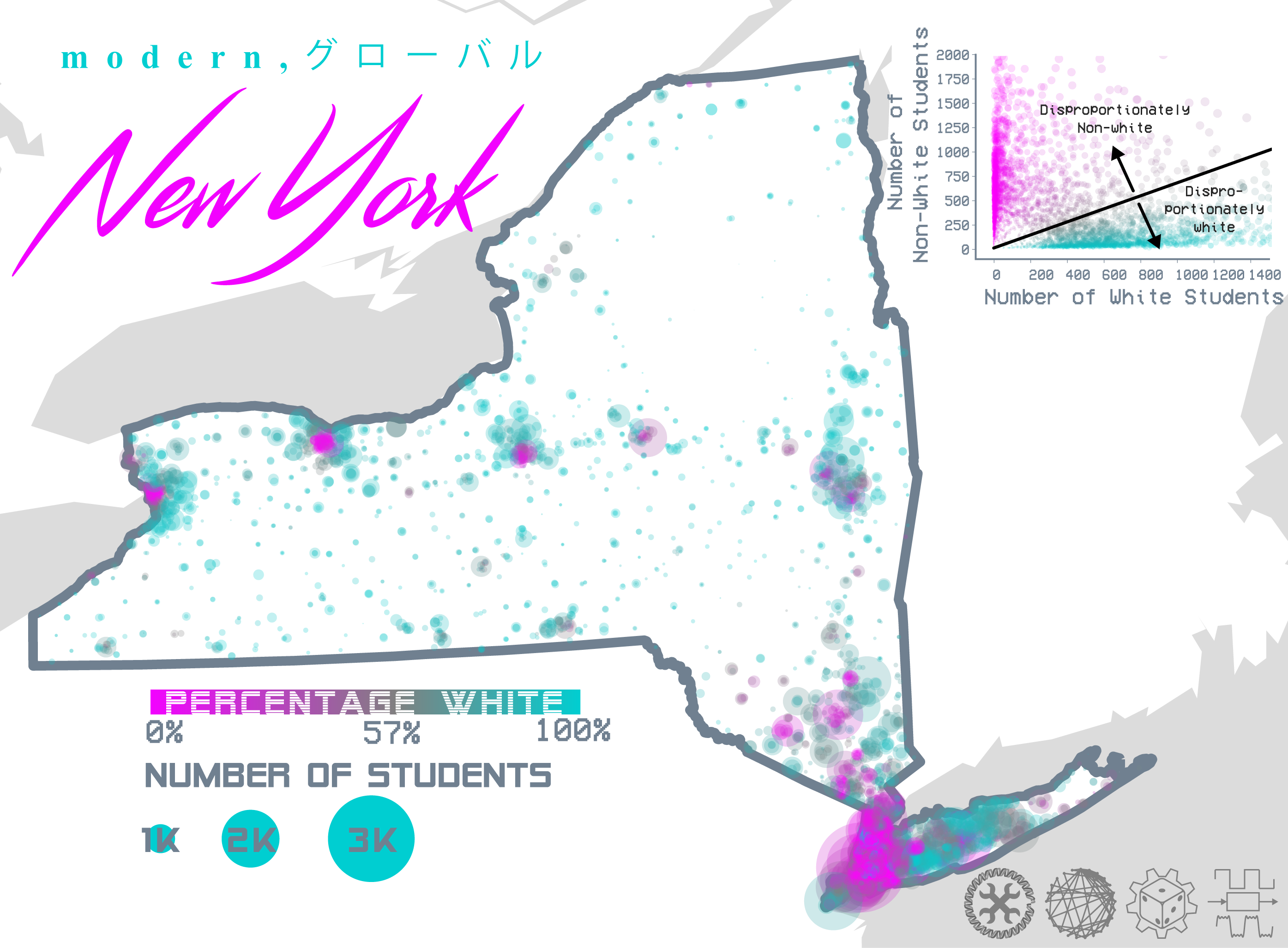
New York shows that certain upstate is disproportionately white while the city is disproportionately nonwhite. Interestingly, even within the city there exists demographic heterogeneity manifested as local clustering.
Verdict : how segregated is your state?
Applying the z-score metric from above we can calculate the average degree of segregation for each state.
What predicts this segregation?
We can consider several covariates with this emergent, de-facto, segregation. First, the demographics of the state matter, as you can’t be segregated if you’re completely homogenous. Mouse over the state below to reveal their % white as well as their segregation score.
However, this variable doesn’t have strong predictive power over whether the state is segregated or not. The level of urbanization of the state seems to have more of an impact. Mouse over the state below to reveal their % urbanized as well as their segregation score.
Afterword
US government data is highly racialized which lends itself to testing these sorts of hypotheses. For instance, tracking distributions of student family income is a little harder. However, statistics like income could be inferred from proxy variables like the percentage of students qualifying in free lunch programs.
Still, these data represent quantitatively disprove the hypothesis that segregation is exclusively a top-down phenomenon that was part of the historical record. It still exists today in part because of the emergent clustering produced from humans tendency to self-associate.
Watch the video essay below for further analysis: