

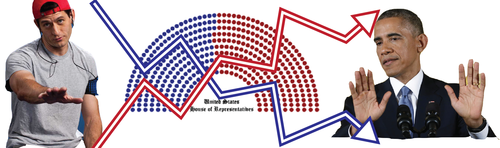
Forecasting the 2018 Midterms Using Tools from Engineering
Red House Rising
 We all know political movements seem to happen in waves - the different political parties are gaining and losing power all the time. But what can their current victories or losses tell us about the future? Can we prove that presidential victories produce losses in congress?
Some things take time
Before we get to politics let’s take a look at any easy example of two things changing in time
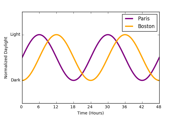
We see that the daylight in Boston and Paris follow the same basic trajectories, but the exact brightness in Boston isn’t a great predictor of the brightness in Paris at any given time. Taken a step further, if we “flatten” the data to remove the time dimension and plot the brightness in Paris vs that of Boston we get the following. Each point on the circle represents the brightness in Paris and the brightness in Boston at a specific time.
An interesting graph that contains some information, but isn’t as informative as it could be. The degeneracy of the data makes each value non-unique, preventing us from determining the exact brightness of Paris given Boston and vice-versa.
There is an answer to this problem that allows us to relate these two signals in a more meaningful way : compare them after a time-shift. If we compare Paris daylight to Boston 6 hours later, we find that there is much greater correlation between the two variables. In plain language, you’re comparing points from the two trajectories at different times.
This operation is the essence of cross-correlation. How much do two signals correlate with each other as you shift one of them in time. We call the magnitude of the shift $\tau$.
Basically, the operation is the sum of the similarity between two time traces as you move one of them around.
Below we see the full cross-correlation of a sine and cosine wave as we move the cosine wave and keep the other fixed. We see that there is a peak cross-correlation at $ \tau=\frac{\pi}{2}$ and the signals are most anti-correlated at $ \tau=\frac{3\pi}{4}$. If you shift the signal backward or forward tau can be positive or negative (g is leading or lagging).
What happens with noisy data?
Cross-correlation is an extremely powerful method of analysis to use on noisy data. Just adding bit of waggle to the sine and cosine waves from above gets similar results.
More importantly, the analysis works even when the data is SUPER noisy. Consider the following set of stochastic differential equations representing Ornstein–Uhlenbeck processes:
Here $\theta$ represents the inverse of the correlation time of the signal while $\sigma$ represents the standard deviation of the trajectory. In this case, I’ve modeled Y as having some linear dependance on X, scaled by the gain “g”. These equations could model any number of stochastic interactions (gene expression, weather patterns) but we’ll use them to imagine an example from the world of finance.
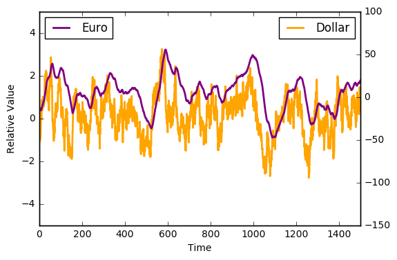
Here we see two time traces representing the value of the Dollar and the value of the Euro. Despite the fluctuations in both of the signals, there seems to be some interdependency. However, the directionality of this relationship isn’t entirely apparent at first glance. We don’t know if the Dollar affects the value of the Euro or vice-versa. We turn to our new favorite technique - Cross-Correlation!!!!
It becomes apparent that as we shift the Euro time trace, the two trajectories become most correlated as $\tau = - 18$ days. The value of the dollar determines (in part) that of the Euro. If this simulated data is to be believed (wink), that means we should BUY BUY BUY Euros if the dollar spikes up, alternatively we should SELL SELL SELL Euros if the Dollar drops in value.
Clearly real economic markets are more complicated than this as the regulation is not unilateral (ie the Euro value will feed back and affect the dollar value). But this analysis does lend insight into how we can take seemingly unrelated stochastic signals and find the underlying correlations.
Understanding Past Political Patterns
The central hypothesis is that presidential victories embolden the opposite party. Lets apply some of the mathematical techniques above to determine whether or not we can calculate the properties of the rise and fall of political groups. First, we gather historical data of US elections.
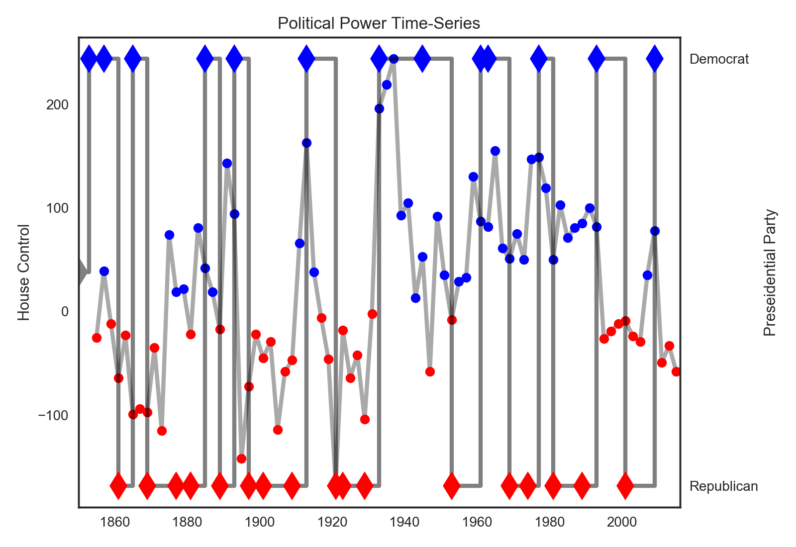
In the chart above we see the trajectories of the presidential wins (diamonds) versus the democratic advantage in the house (dots). It seems like a qualitative first glance reveals that the mechanism of political turnover has changed. For instance, in the past (1800’s, 1900’s) one party at a time dominated the presidency and the house at the same time. However, it seems more recently there are these competing oscillations. To investigate for yourself, play with the interactive version of the same chart below (this time with senate data added ; looks better on desktop).
Calculating the future
To quantitatively investigate whether the presidential election influences the house majority, we compute the cross-correlation on this data to produce the following two graphs.
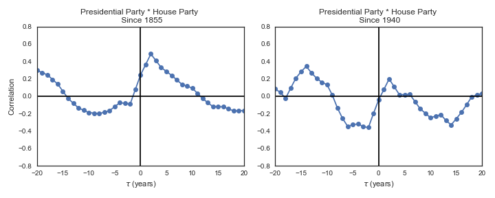
First, I’ve computed two functions - one including all the data since 1855 and the second just on the data since 1940 (an arbitrary demarcation for the inception of the modern definitions of the republicans and democrats). The upshot is that both predict house flips to the opposition party as a function of the presidential party, however it is more pronounced in the after 1940 data set.
To help point out the features of this graph, I annotated the one below just to show what this method of analysis predicts in the current context.
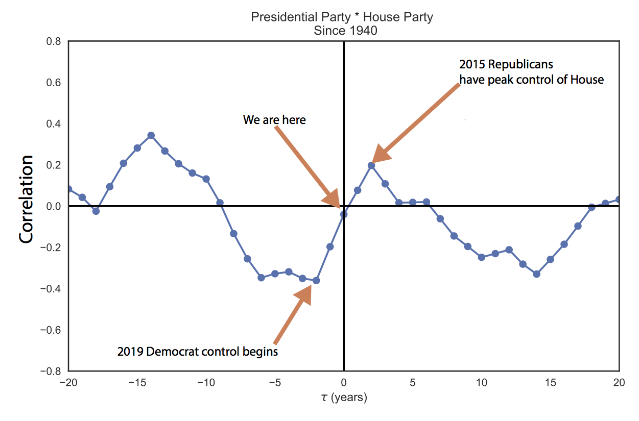
So cross-correlation predicts the house to flip to the democrats in 2018 and stay there for another election cycle. Granted, this is a probabilistic system subject to variability and a correlation coefficient of 0.4 isn’t exactly a mathematical certainty. But if historical trends are any indicator, we should be in for blue midterms and continued democratic dominance in 2020.
Conclusion
Cross-correlation is an essential data science technique to understand the flow of information in dynamical systems including genetic networks, finance and the climate . It can lend insight into systems like politics which have time delayed interactions between different events. The above analysis shows that presidential victories may influence/predict the success of subsequent house races.
Addendum: Numerical Cross-Correlation is data hungry
If the signal to noise ration is high in a given relationship between two time-series, it may require a relatively long data set in order to detect any apparent cross-correlation. The animation bellow illustrates this point by calculating the numerical cross correlation of two time traces (blue dots) and comparing them to the exact analytical solution to the cross-correlation of the two functions.
In order to get the numerical calculations to converge to the exact solutions we need a relatively long simulation. This can be very problematic when calculating cross-correlations using real data sets as it’s possible a given time-series of collected data is insufficient to effectively calculate any underlying phenomena. However, the time it takes to converge to the exact solution is a function of the signal to noise ratio and as such shorter data sets will be sufficient for less noisy data.
notes:
-
I got the historical congressional data from here
-
I didn’t include the data from the 2016 election because it’s all still 2real4me
-
I hacked this together on a couple jupyter notebooks in python, if you’re curious as to how I made the animations you can find the code here. Interactive plot was done with plot.ly)
-
Cross-correlation does assume the underlying phenomena are stationary and ergodic. There are work arounds for these assumptions but they are usually pretty messy.