

Easing Animations with Python
.svg)
Building Animations in Python
While they may be over-hyped these days, animations are a key form of data visualization. Some things just look better changing over time. Also, while some languages like d3.js or processing put a focus on animations first, Python remains relatively clunky to use if you want to make smooth animations that pop.
Take for instance an example animation like the one created exclusively in python below:
1
2
3
4
5
6
7
8
9
10
11
12
13
14
15
16
17
18
19
20
21
22
23
24
25
26
27
import matplotlib.pyplot as plt
import numpy as np
from matplotlib import animation
plt.close('all')
colors = [ 'teal']

fig_animate, ax = plt.subplots()
dots = []

dots.append(ax.plot([], [], linestyle='none', marker='h', markersize=30, color=colors[0]))

ax.set_xlim([-1,11])
ax.set_ylim([-1,11])

data=np.round(3*np.sin(np.linspace(0,6*np.pi,100))+5)

def animate(z):
    dots[0][0].set_data(data[z],data[z])
    return dots

anim = animation.FuncAnimation(fig_animate, animate, frames=len(data), blit=False)

ax.set_facecolor('#d3d3d3')
writer = animation.writers['ffmpeg'](fps=10)
dpi=300

anim.save('dot.mp4', writer=writer,dpi=dpi)

The power of Easing
We see that indeed things are moving over time, but they don’t have that orgainic feel that we’ve come to expect from visual data.
The big thing absent here is easing. Easing is the process of interpolating between two points in order for the animation to no longer look jerky. Use the interactive below to explore a few differnt types of easing.
We see intuitively than any form of interpolation between point A and point B make the whole thing feel a lot more natural - it takes away the appearance of a slide show.
Implementing Easing in Python
I wrote a small packages that facilitates easing in python by adding differnt types of smoothing between datapoints.
This is how it works:
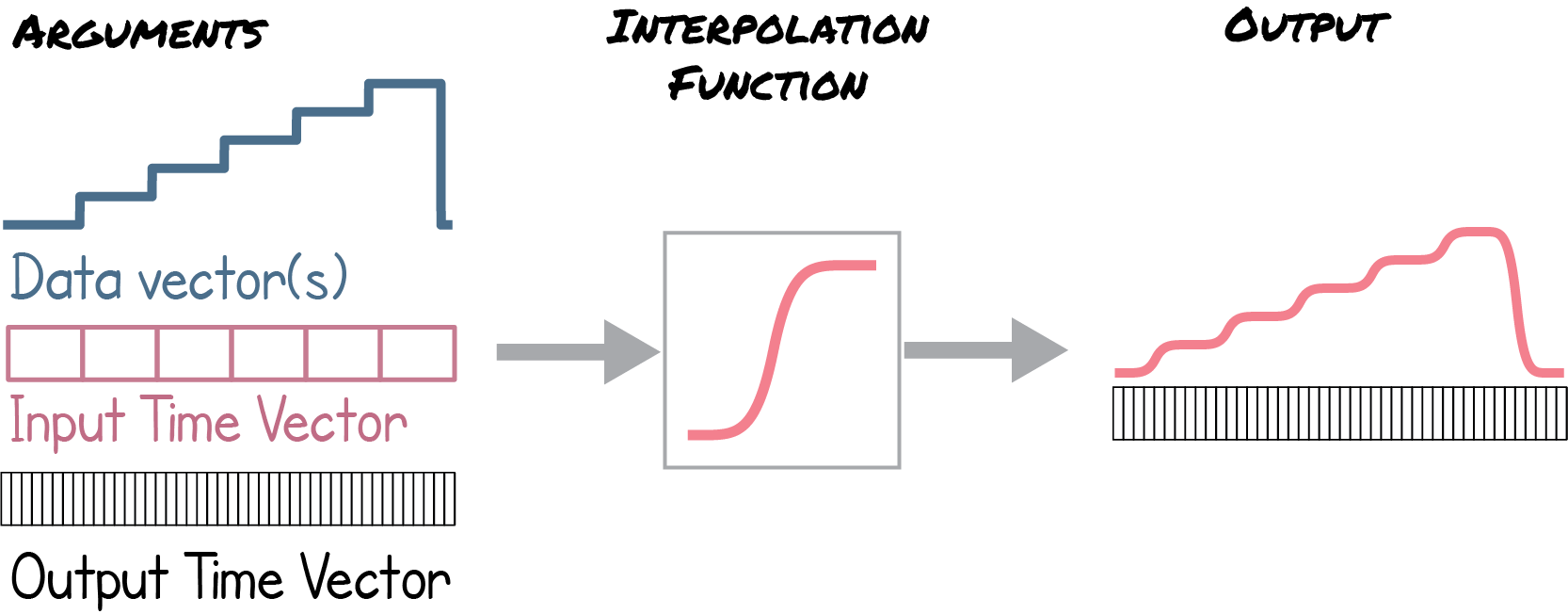
All you have to do to make it work is pass in an original datavector, it’s time vector and and output vector. Then execute one of the interpolation functions on it and it will return nice interpolated data:
ease = Eased(data, input_time_vector, output_time_vector)
out_data = ease.power_ease(n)
All the code necessary to implement this can be found here
Applying our tools to African Conflict Data
So what does this stuff look like on real data? Below are some graphs that show violent conflict within the african conflict over time with various types of easing.
The first is just a barchart of the cummulative dead over time:
The second is a distribution of the fatalities per event over time:
This final animation brings several types together and shows how you can impliment but 1d and 2d easing.
Conclusion
Watch the video below for a presentation on this material:

Notes:
- Github Repo with animation library
- African conflict data from here