Flight Delays
The Worst Airports in America
What makes a bad airport? There’s a lot that can go wrong with a flight - like having to ride in a snow crawler as in Washington Dulles. But we can all agree that having your flight delayed is one of the worst things.
By extension, looking at the number of delays per airport is a good way to rank the quality of those airports. The chart below shows the worst airports for total numbers of delays.
Anyone that’s been to O’hare shouldn’t be suprised by this. I should note that I scraped this data over two weeks in April 2018. But there’s no reason to believe this data isn’t representative of the norm as there were no big weather events.
Clearly, we’ve selected a lot of big airports here. So naturally the next question is which airports have the worst percentage of delays.
Note, I just looked at airports that had more than 1000 flights over the last two weeks. That removed all the small air-feilds with bad track records. I’m not interested in airports that made 100% or 0% of their on-time numbers if they only had a few flights period.
Surprisingly, O’hare isn’t even on this list. Take that Midway! Memphis takes the cake with an astounding 35% of flights delayed.
Case Study: New York Airports
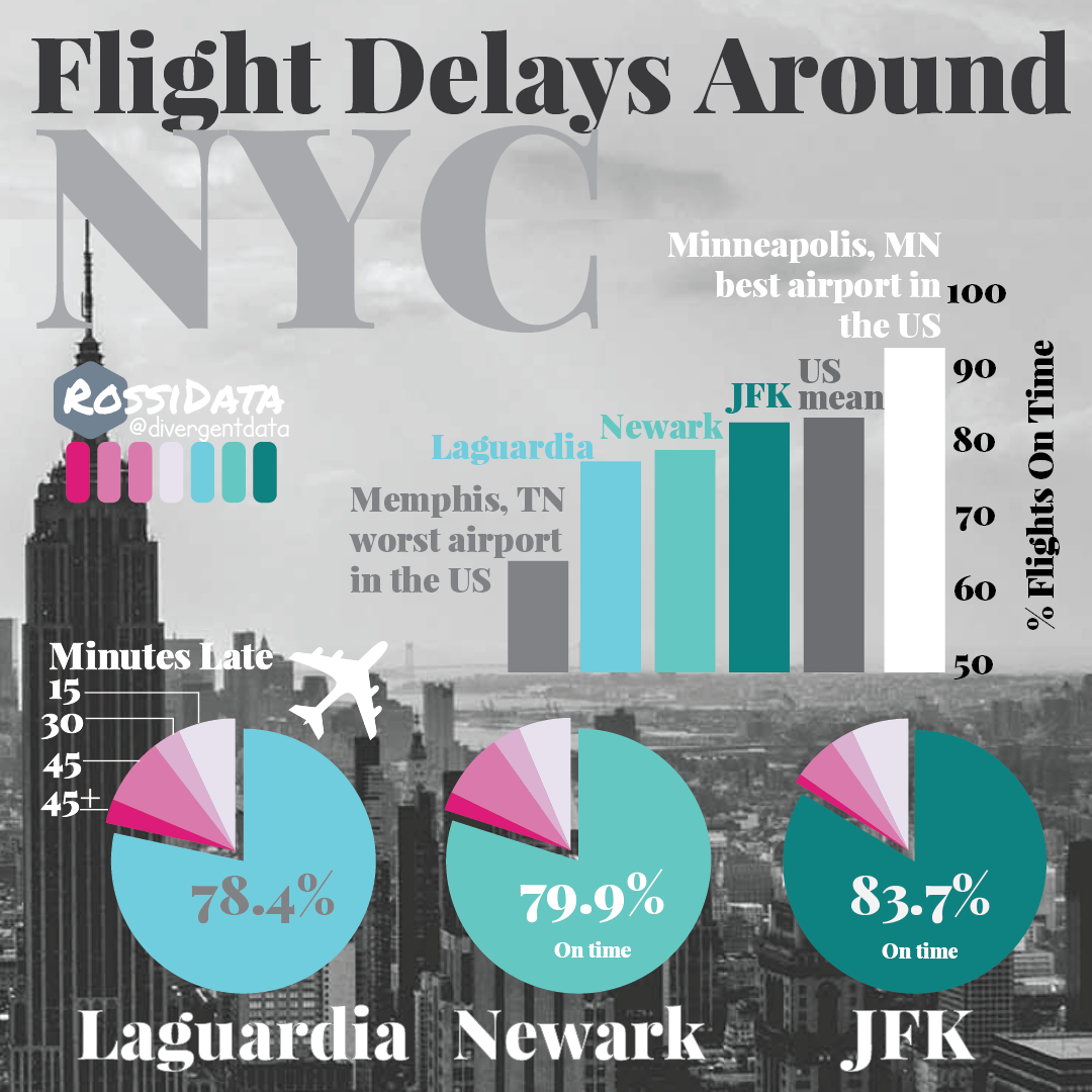
Let’s just consider for a second some comparable airports - those that surround NYC. They each serve comparable volume with JFK and EWR each running ~4000 fights a week and LGA launching ~3500 (data averaged over 2 weeks in april). Now if you’re going to book a ticket through one of them which should you pick? Well, JFK is the best in terms of on-time flights with just slightly below the national average for on-time rates. However, they’re not radically different from each other compared to the outlier major airports of Memphis and Minneapolis.
Relationship between size of airport and number of delays?
Does a bigger airport necessarily mean more delays? Not so much. You can explore the data below to find out for yourself. Mouse over to see airport details. The toggle switch changes between linear and log axis for the number of airport delays (this helps visualize the data). The size of the dots scales with the number of total flights from that airport.
Turns out Portland and Minneapolis are both really good for their size, while Memphis, Midway and Philly aren’t so good.
Locations of bad airports
To visualize this spatially, we can plot the total number of delays by location. The animation cycles between total delays, the percentage delayed at those airports and the state in which they’re located.
Conclusion
Watch the video below for a presentation on this material: