How to Lie with Histograms
Same Data, Different Stories
One of the most foundational techniques used in visualization is the histogram. This type of figure allows us to look at populations of numerical data and intuit how values are distributed, as well as what the general statistics of the system are. Basically it’s a way of looking how common something is. The only problem with them is they’re easily manipulated. You can bamboozle someone easily depending on how you plot them. This comes from the fact that data in histograms is binned - that mean you put the data in little categories in order to plot it.
As a case study lets check out some data on undergraduate acceptance rates.
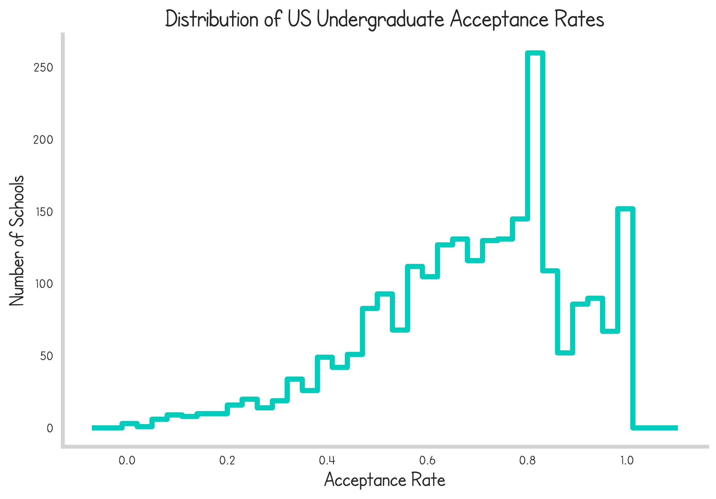
Now in this case, we have linearly spaced bins between 0 and 100% acceptance rates. It demonstrates clearly how the majority of schools accept the majority of students and how elite, picky institutions are relatively rare.
The first failure point in the presentation of this data is the scale. Projecting the same data onto a logarithmic x-axis produces a qualitatively different impression from the data.
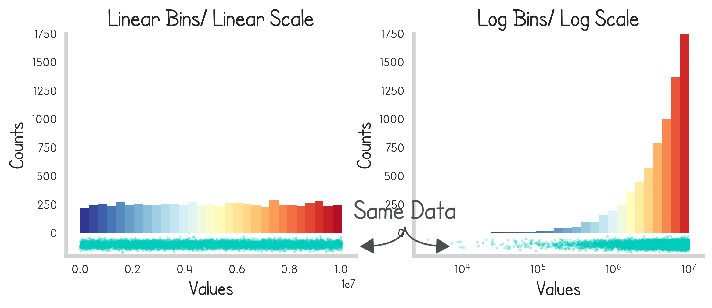
Even without considering histograms, granular data itself changes its qualitative impression through the lense of a different axis. Consider the interactive figure below to see how a simple, normally distributed random variable looks different on these two scales.
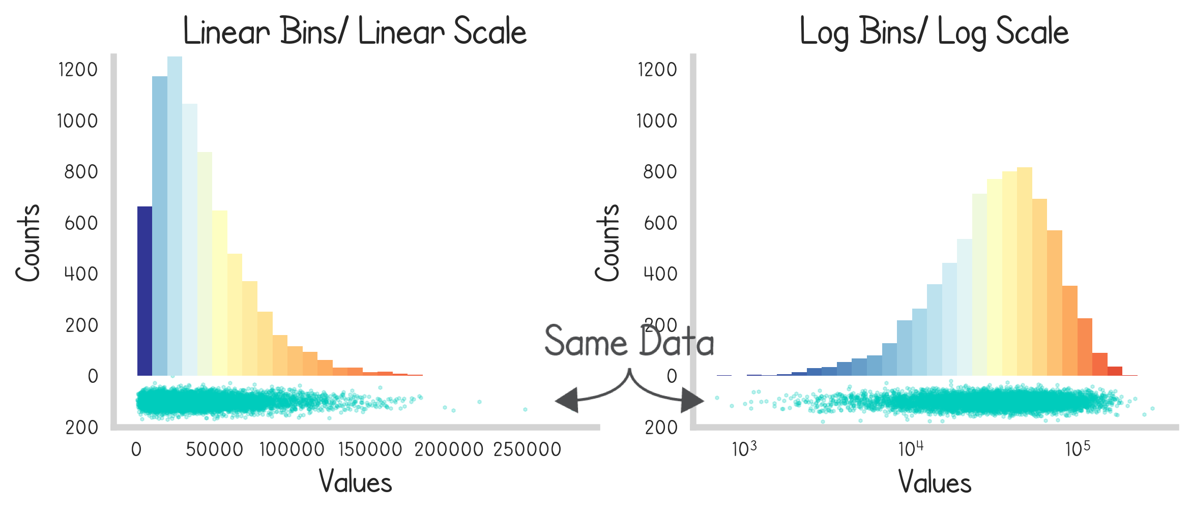
So why would we ever want to use anything besides linear scales if they change the qualitative impression of the data? Well, certain data sets lose a lot of their nuance when projected onto linear axis. Consider the distribution of U.S. firm sizes. There are lots of big firms and a few small ones. This doesn’t look great on a linear axis.
Scaling the bins
Walking back a bit - it’s important to note that the bins selected for histograms are entirely arbitrary. It’s up to the visualization author to decide which ones to choose. In fact logarithmically scaled bins (bins that appear uniform on a logarithmic scale) will present very different impressions.
The simplest example of this would be a uniform distribution. Presented two bin-scales gives two very distinct impressions.
This extends to other types of statistical distributions like the gamma distribution…
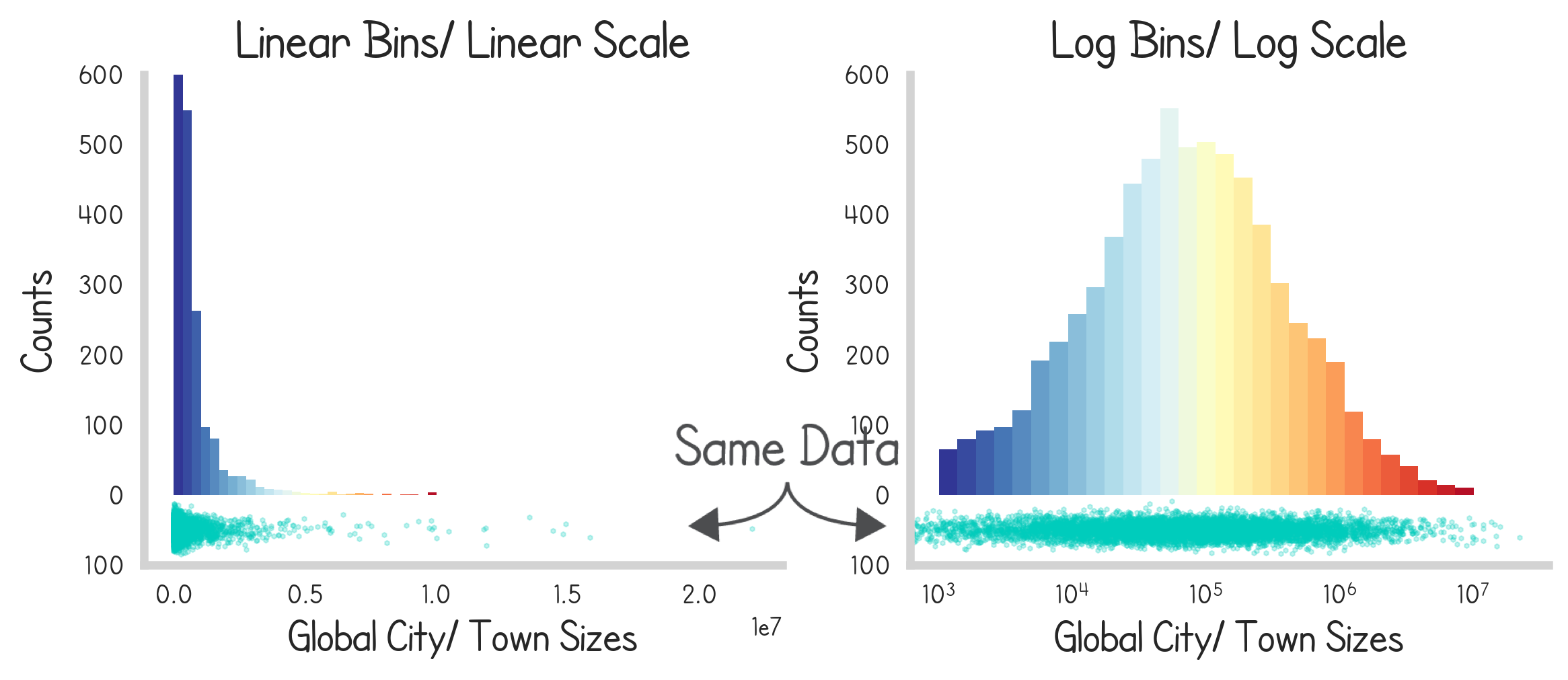
As well as real data. Below we see the distributions of the sizes of global cities and towns.
Conclusion
So clearly there is a lot of subjectivity in how distributions are presented with histograms. This comes in many ways because there is no truely right way to do it. There are only a few guidelines:
- If you’re consuming data, pay attention to the pitfalls that can happen here. If the author is unclear about how they binned or projected the data it’s an immediate red flag.
- If you’re creating data, help out the viewer by drawing attention to your axis if you do anything besides a linear scale.
- If you have the ability, try to find and present the granular data (individual points) it’s always better.
Watch the video essay below for further analysis: